
website redesign
user research / ux design / ui design
Overview: Brooklyn based highschool, The High School for Youth and Community Development (YCD) is a collaborative and inclusive community dedicated to empowering their students to become lifelong learners by providing equitable support, fostering personal growth and developing an innovative mindset to prosper in the global world.
They reached out with the goal of having their website redesigned and developed because they were unable to maintain it due to the website platform, the content was outdated and they wanted to involve members of the community in the creation of the new website.
Timeline: 3 months
My Role: On this project, I served as the project manager, user researcher and visual designer.
Website Link: https://www.ycdhs.org/
Research
Method #1: Survey
For those who weren’t able to attend the scheduled interviews, a survey was sent out to uncover pain points, understand current website behaviors, learn the brand perception of YCD and ways to improve the website.
Method #2: Interviews
Medium: Zoom Calls
# of Participants: ~18
3 Focus Groups: Students, Staff Members, Parents
Length of Calls: 1 Hour Each
Research Questions
YCD Branding
— In your words, what is the mission of YCD?
— What words would you use to describe YCD?
— What does YCD mean to you?
— What are the school colors?
Website Behaviors
— How often do you frequent the website?
— What pages do you visit most often?
Website Design
— What is your impression of the home page? Is all the content relevant?
— Is there anything that should be removed or added to the home page?
— How do you feel about the design of the website?
— Do you find the images on the website useful and relevant?
Website Usability
— What do you like about the existing website?
— What do you dislike about the existing website?
— What would you like to change on the existing website?
— Is there anything you would like to see in the new website which is missing in the existing website?
Navigation Usability
— How difficult or easy is it to find the pages you’re looking for?
— Are the current navigation groups accurate? Is there anything missing?


Features for MVP
Modern design
Fun/Playful website
Updated images of the school and students
Functional links on the website
Updated school stats
Events page
Testimonials page
“How to apply” page
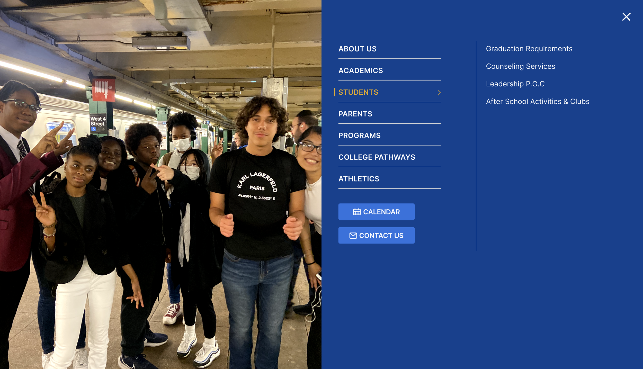
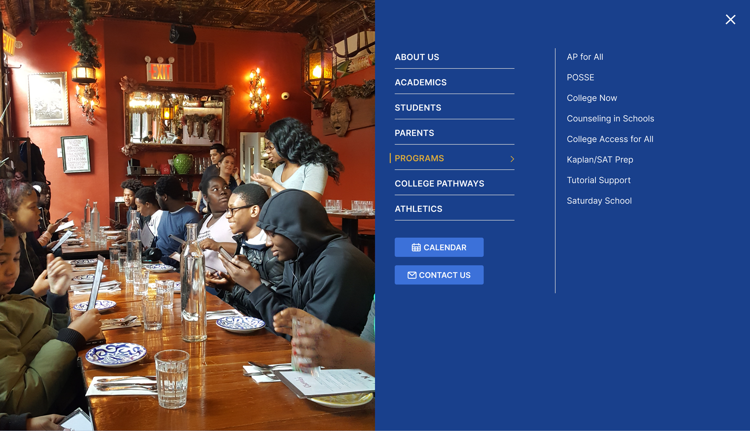
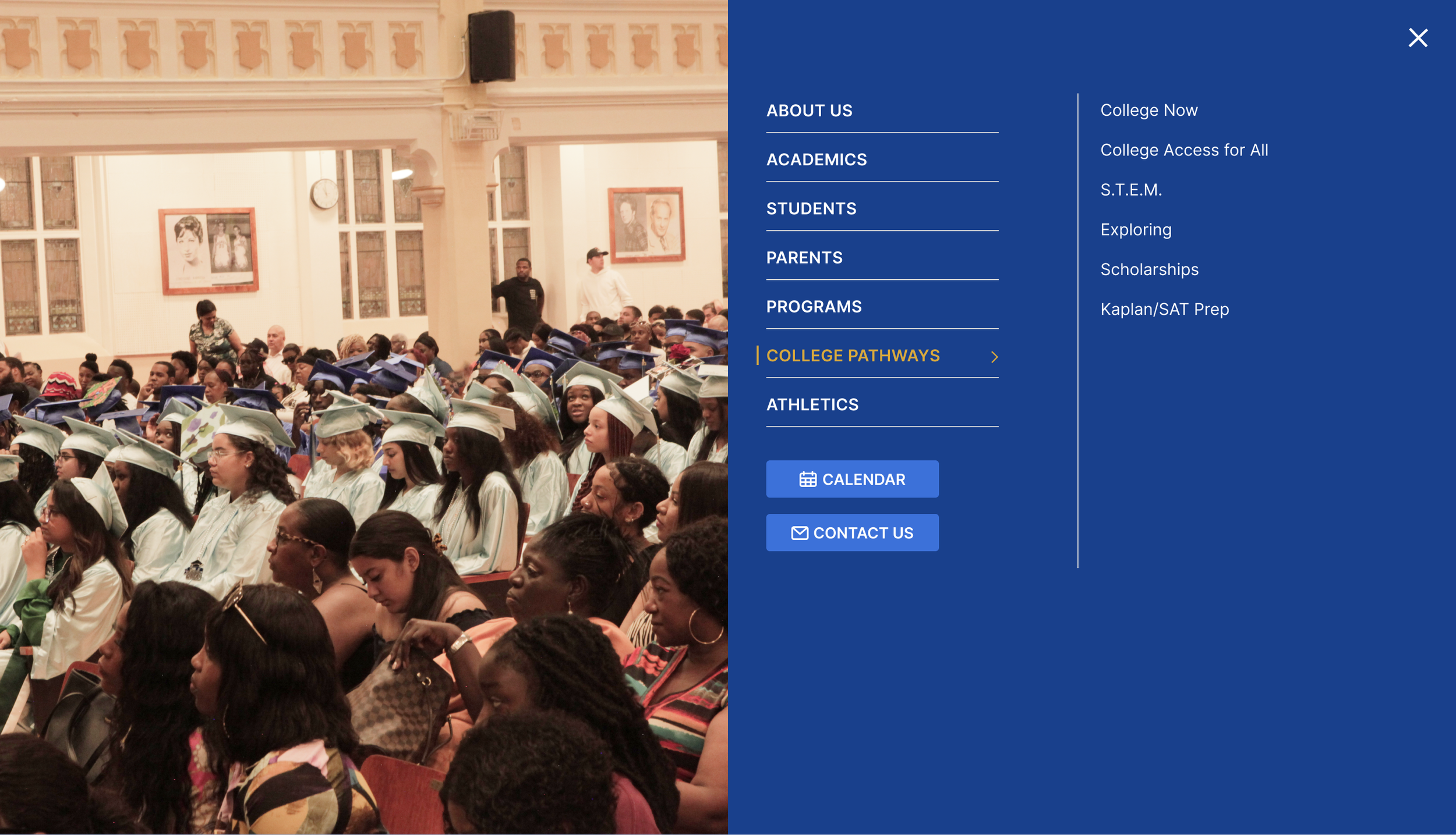
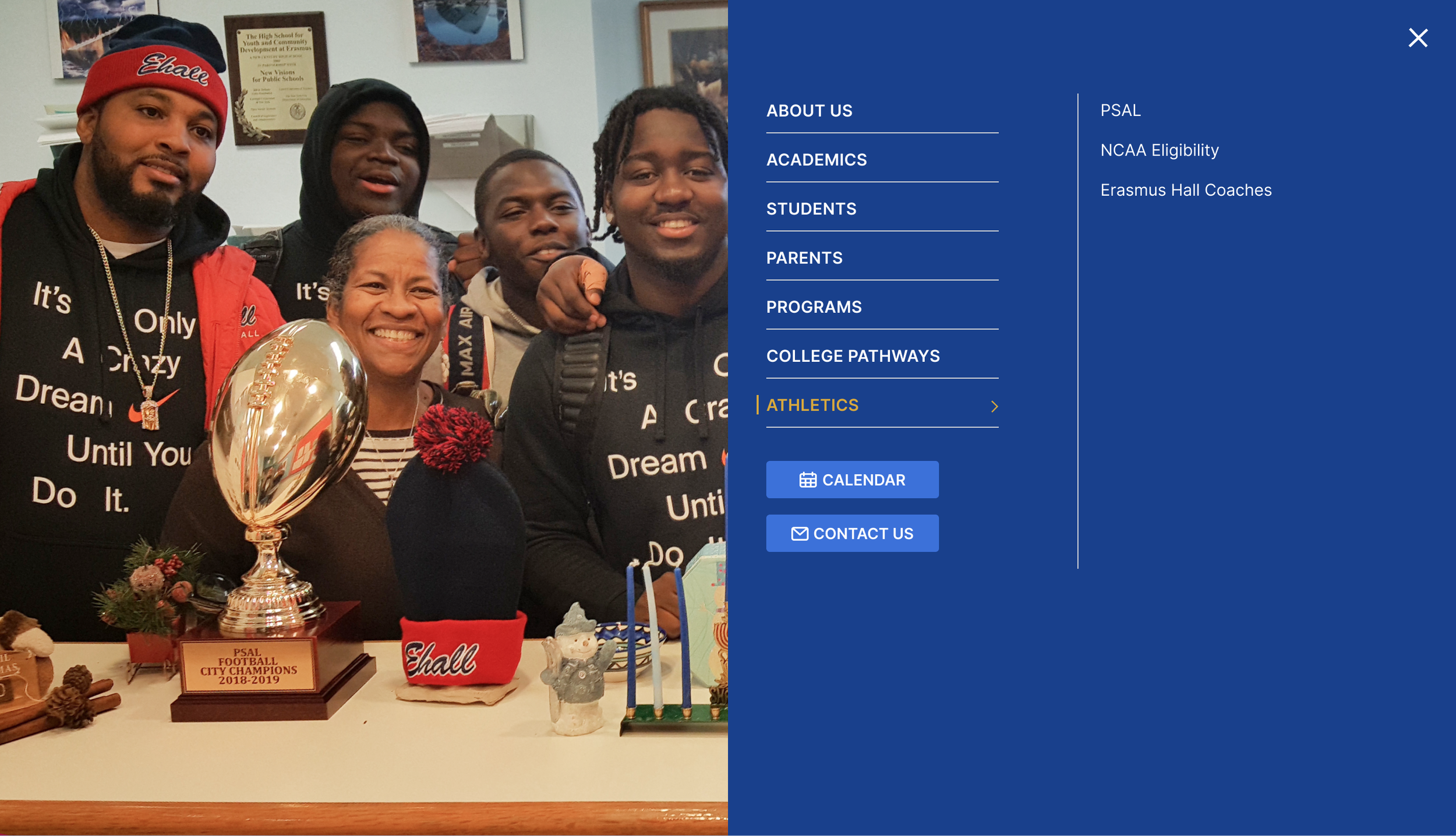
Navigation

As we were thinking of the design, we wanted to take an approach that emphasized the home page and didn’t overwhelm it with the numerous options available for the navigation. By having the navigation hidden by one click and taking over the full page, it’s easy to expand upon the content if needed in the future. And we worked with the school to walk through each item in the navigation to determine if it was in the right subsection and if it was necessary.


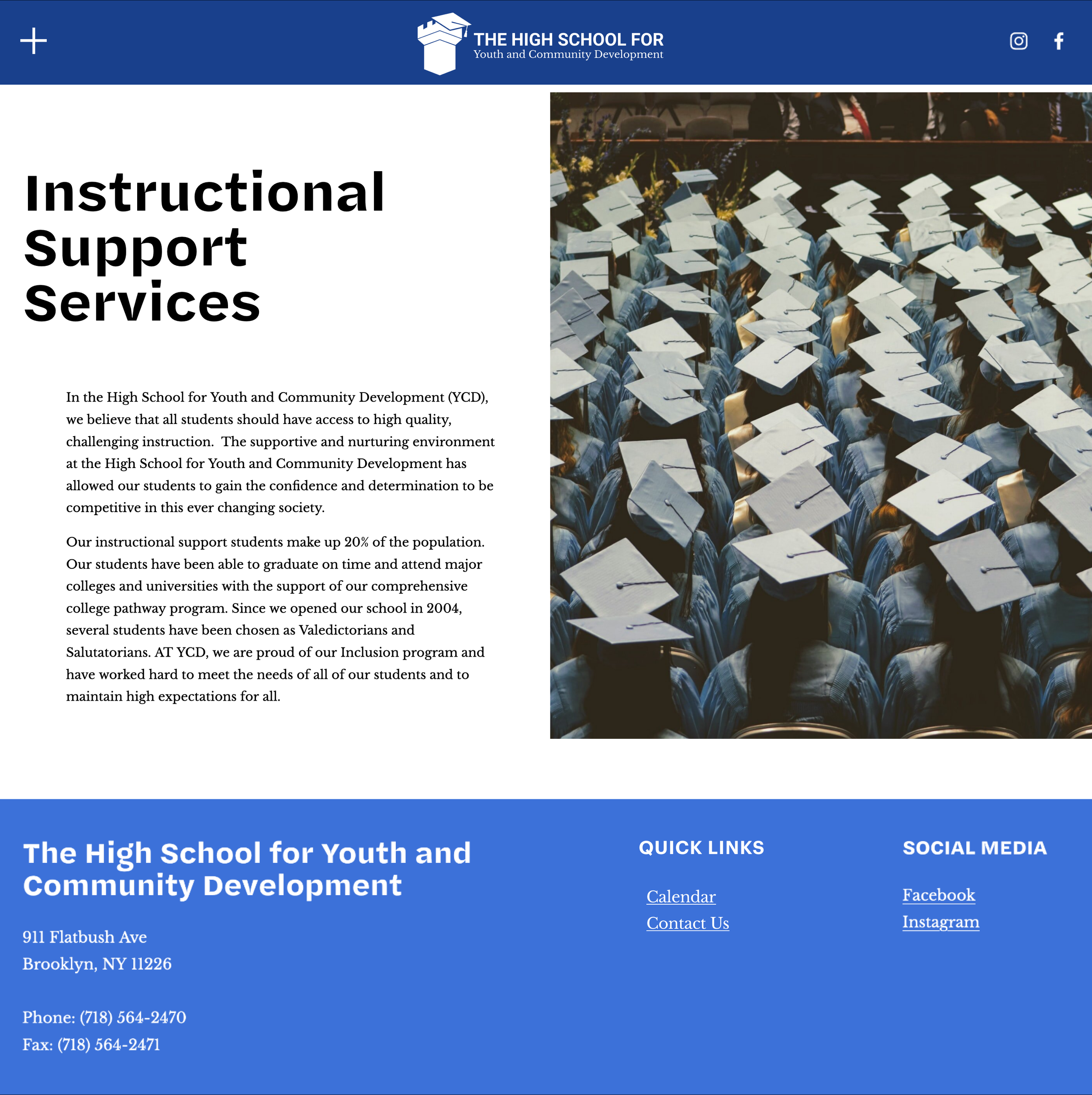
Home Page


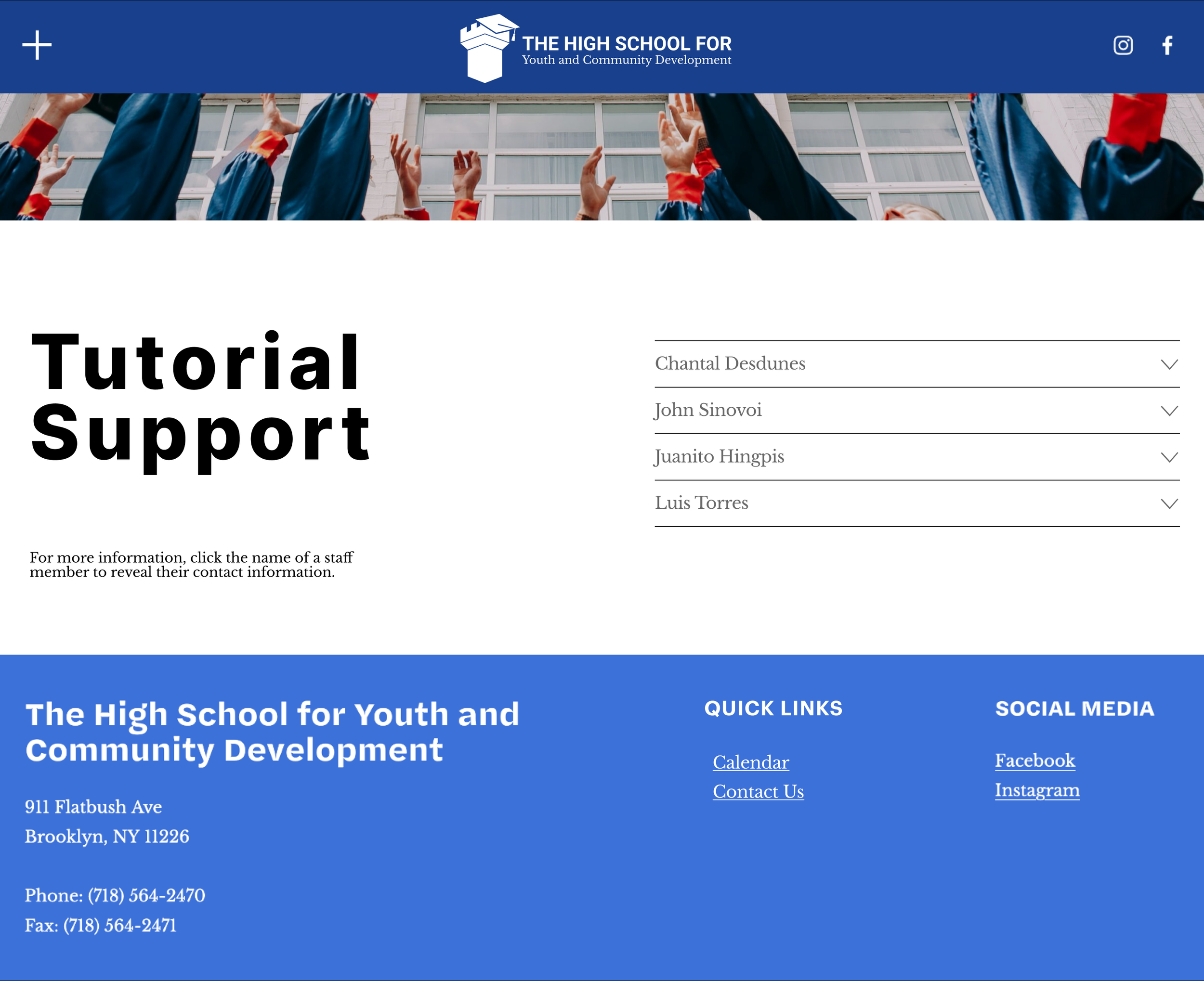
Staff Directory
The previous staff page contained inaccurate information (ex. names of people who no longer worked at the school) and it’s a tedious process to find a specific staff member without knowing their department.
The new design takes a more visual approach and improves the user experience through the following features:
Directory with name, department, picture and email address of every staff member.
Search functionality by name and department
Sort by department
Contact staff member


As part of our hand off process, we created written documentation and videos to show the process for making changes to the website (specifically in the areas with custom code). In addition, we provided staff members with a proposed list of recommendations for the next phase of the website redesign.
Handoff

Recommendations for Phase 2
of Website Redesign
Testimonials from students, parents and staff members
Video interviews with students
Updated mission video
Alumni page
A community based logo creation competition
Information on safety, security and transportation for prospective parents
Reorganized navigation section